Brighter, bolder and better –
A hot new look we’re proud to share.
It might seem like things have changed overnight, but this is a design overhaul based on 8 years of learning and evolving as a brand. Creativity has always been important to us and through these new designs, we hope to communicate better who we are and what we value.
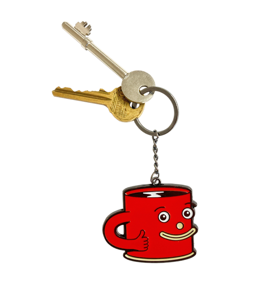
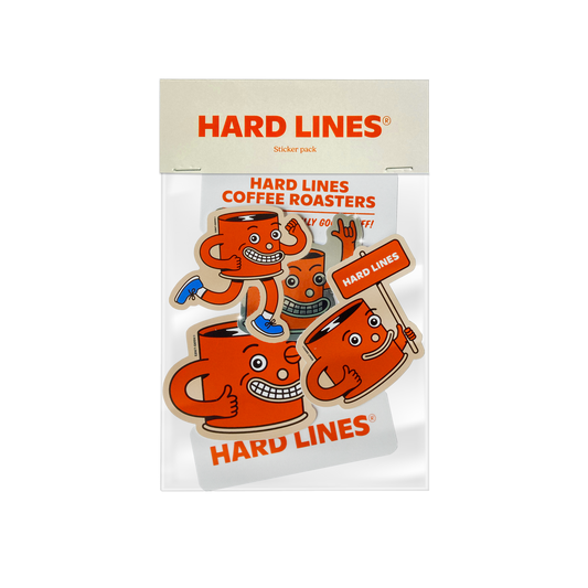
It felt important to us that our mascot, Cuppy, born in 2019, be more of a dominant presence in our visual story. Cuppy is our representative—cheeky but reliable—and it felt essential to incorporate their energy into the refreshed look of our packaging.
Although the change might feel sudden, this was no quick turnaround! Our in-house design team has been chipping away at this for nearly two years. A lot of careful consideration and research has been done to update the identity of our packaging. Throughout this project, the goal was to make clear, purposeful and practical design decisions—decisions that help differentiate our products and improve the customer experience.
We believe that this new streamlined aesthetic solidifies the world of Hard Lines.
The new coffee bags are split into two ranges: Classic and Seasonal. We’ve chosen three bold and intentional colours to represent our Classic coffees.
Brown for House Party, our best-selling brew. Green for the Canton Blend, a seasonal blend built by our baristas for our cafe and community in Canton. Orange for I Love Decaf, inspired by West Coast diner culture—ask for a decaf filter there and you’ll likely see it poured from an orange pot.
Our Seasonal range offers variety and a chance to try something new and exciting, moving with the seasons and showcasing different origins. These coffees are limited and won't hang around for long.
In streamlining the design we also improve the packing process at the roastery. Less time stickering means more time for coffee, refining roast profiles, organisation, learning and developing valuable new skills. It also means a reduction in the amount of waste we were producing by constantly buying stickers on a roll.
Having new bags printed also means we can showcase our commitment to 1% for the Planet, continuing to donate 1% of our total turnover to charitable causes every year. This fresh new look feels like a real milestone in the Hard Lines adventure and we couldn't be more proud. We love the changes and hope you do too!


